The Shard Visit / Visitando The Shard


Screen Shot 2016-03-31 at 12.09.43 PM

Photo from the-shard.com / Foto de the-shard.com

EN/  The Shard Visit

This month we strolled a special date.
The visit was also special since it’s not every day we see the view from the tallest building in London (and European Union).

The building opened in 2013, there are offices, restaurants, hotel and the apartment of the smart architect, Renzo Piano that instead of getting paid for the work, asked for a flat in return. Of course for tourists and others, it has 2 floors to visit and enjoy the view, and a souvenir shop on the ground floor to secure a souvenir of the visit.

The Shard measures 306m in height, and to get the visitation floors 69 and 72 you have to take 2 elevators. For all this height, they are quite very fast. They say the ideal is to go at sunset time, which varies greatly in London (both in time and as visibility). I bought the ticket one month in advance, and didn’t even know that about the sunset to be honest. And lucky, I chose the right time to leave time off work, get out there and not be too dark for this time of year,  18pm worked well.

Screen Shot 2016-03-31 at 12.36.03 PM

PT/  Visitando o “The Shard”

Esse mês fizemos um passeio numa data especial.
O passeio também foi especial já que não é todo dia que vamos ver a vista do prédio mais alto de Londres (e União Européia).

O prédio foi inaugurado em 2013, nele existem escritórios, restaurantes, hotel e  o apartamento do arquiteto esperto, Renzo Piano que ao invés de receber pelo trabalho, pediu moradia em troca. E claro para turistas e afins, tem 2 andares para visitar e apreciar a vista, além de uma lojinha de souvenir no térreo pra garantir uma lembrança da visita.

The Shard mede 306 m de altura, e para chegar nos andares de visitação 69 e 72 temos que pegar 2 elevadores. Pra essa altura toda, eles são bastante rápidos até. Dizem que o ideal é ir no horário do pôr do sol, que em Londres varia muito (tanto em horário quanto visibilidade). Eu comprei os tickets com 1 mês de antecedência, e nem sabia disso do pôr do sol pra falar a verdade. E demos sorte, escolhi um horário que desse tempo de sair do trabalho, chegar lá e não estar muito escuro pra essa época do ano, 18hs deu certinho.
Continue reading

On Diane Arbus, Part II

EN/   On Diane Arbus, Part II

Please read “On Diane Arbus, Part I” first by clicking here.

PT/   Sobre Diane Arbus, Parte II

PT/ Por favor leia “Sobre Diane Arbus, Parte I” primeiro clicando aqui.

7

Untitled 11 (1969/1971) / Sem Título 11


Untitled 11
is an image from another series taken in an American mental asylum, which opposes the idea of “intention and effect”. In this case having Down Syndrome keeps them away and preserved from additional masks people put on themselves, being naturally very spontaneous and truthful. This photograph different form the other two, is not as formal and cropped into detail, which makes clear sense of a carefully thought choice of composition, to demonstrate this moment of interactivity and involvement between subject and photographer.

PT/ Untitled 11 é uma imagem de uma outra série feita em um asilo para doentes mentais americano, que se opõe à ideia de “intenção e efeito”. Neste caso ter Síndrome de Down os mantém longe e preservados de pessoas adicionais máscaras colocadas sobre si mesmos, sendo, naturalmente, muito espontâneas e verdadeiras. Esta fotografia diferente das outras duas, não é tão formal e cortada no detalhe, o que torna clara a escolha cuidadosamente pensada na composição, para demonstrar esse momento de interactividade e envolvimento entre sujeito e fotógrafo.
Continue reading

Athens/Atenas 2015

AthensMar_12

Acropolis at night/ Acropolis de noite

EN/   Athens, March 2015

PT/  Atenas, Março de 2015

One of my biggest childhood dreams was to visit Athens. I’ve always loved studying about ancient Greece in school and fascinated me to imagine one day to be there and see Temple of Olympian Zeus.

When we finally went there last year, the modern city surprised me, I felt at home with the similarities with Brazil, with the receptivity of the Greeks and the wonderful cuisine. We arrived just in time of the rain welcoming the Spring, the weather was pleasant besides getting wet.

The first adventure was to choose a cake having with no idea of its flavour.
Talking to a bartender we got to try traditional drinks such as Raki and Mastiha.

Screen Shot 2016-03-26 at 12.25.45

It was a delicious chocolate caramel coffee cake / Era um delicioso bolo de chocolate com caramelo e café

PT/ Um dos meus maiores sonhos de infância era conhecer Atenas. Sempre adorei estudar sobre a Grécia Antiga na escola e me encantava em imaginar um dia estar lá e conhecer o Olimpo, Templo de Zeus.
Continue reading

Six Cities with Polaroid/ Seis Cidades com Polaroid

FB_IMG_1458750177910

My temperamental Polaroid/Minha Polaroid temperamental

EN/   Six Cities with Polaroid.

In 2013 I went for holidays back home in Brazil, during the months of July and August which is “winter” over there. I planned a couple of trips between my hometown Santos in the state of Sao Paulo, and 2 other States. In total I stayed in 6 different cities, and in each I took a Polaroid photo. I will show them all here!

PT/    Seis Cidades com Polaroid.

PT/ Em 2013 eu fui passar as férias no Brasil, durante os meses de Julho e Agosto, que é “inverno” por lá. Eu planejei algumas viagens entre a minha cidade natal Santos, no estado de São Paulo, e 2 outros estados. No total, eu fiquei em 6 cidades diferentes, e em cada uma eu tirei uma foto com a minha Polaroid. Vou mostrar elas todas aqui!
Continue reading

On Diane Arbus, Part I

el-estilo-fotogrc3a1fico-de-diane-arbus

Diane Arbus


EN/   On Diane Arbus, Part I

Overlapped on the genres of Portraiture and Documentary Photography, having people as her subject Diane Arbus looks close at the ones in which most of people would either look away or stare for judgments. Photographing people has always involved identity, beauty and their place in society in a way it would please who would consume the images, being for personal use, public or scientific.

The idea that a portrait can determine what personality or life you have has been taken seriously with the pseudo-Science called Eugenics, making serious use of photography as tool to document, measure and establish types. The ones who could cause a social & political disorder by weakening imperial superiority, either for being a criminal or having a serious pathology in which would consider this individual disabled, was nominated as the “Residuum” by the theorist, Lombroso. This theory is not so actual anymore as well as the ideal/perfect “race”, but the notion of “other” to classify people as more or less important in society is still in evidence and has always been portrayed with photography.

In a way Arbus tried to subvert the way this rejected group of people are seen, just simply by photographing them and letting the photos attract further attention than those individuals would ever get on the streets, by looking into what they are more than how they look. As she wrote on An Aperture Monograph, “Essentially what you notice about them is the flaw”, by elevating their images with photographs it gives them an extra importance, and questions people’s curiosities about their self, creating a deeper connection in which the photographer was the bridge between the Freak and the “norm”.

Known as the photographer of the Freaks, Diane Arbus had to go out of her comfort zone to find out what the classified freaks’ features are to be nominated like this, and therefore she went to varied locations where they could be found. This one of the man in bikini, the transvestite curiously have the right arm and leg shaved and the left arm and leg not shaved, it preserves the polarity of his persona as body and soul. Certainly it would be the clue for the mystery many people passing by would have to try and recognize “what it is”, as if not being able to define it would terrify people. Here the Dualism the French philosopher Descartes talks about would be applied as said: ” The soul, by which I am what I am, is entirely distinct from the body.” Away from any judgments, but being exposed to a camera the transvestite looks quite serene besides the carnivalesque costume, the background seems to be a conventional place, which could be a home that any “norm” could live.

man-in-bikini1

The gap between intention and effect is how Diane Arbus calls to define the difference of appearance and reality, in a society where masks are constantly used to reaffirm positions, identities and possessions. This portrait (in the text bellow) makes part of a series taken of circus people and puts tattoos as the freakiness, but in this case it becomes entertainment which is one of the ways freaks gets attention, by subverting their nomination and appearance for their own good. Again the subject looks straight to the camera, but more in a intimidating way, which seems to be part of his character for the act and show, but yet seems very open to be photographed.


PT/ Sobre Diane Arbus, Parte I

Sobreposta sobre os gêneros de retratos e fotografia documental, tendo as pessoas como seu assunto principal, Diane Arbus olha de perto aqueles em que a maioria das pessoas quer desviar o olhar ou olhar para fazer julgamentos. Fotografar pessoas sempre envolveu identidade, beleza e seu lugar na sociedade de uma forma que fosse do agrado de quem iria consumir as imagens, sendo para uso pessoal, público ou científico.

Continue reading

Brighton, March 2015

EN/  Brighton, March 2015

Last year we ran away from London for a night in Brighton to see the sea.
It was cold, windy and rainy, but still beautiful.

I was born by the seaside, and now living around 8 years in London that I realize how much I miss the sea. Brighton’s beach is far from being similar to my hometown’s, Santos. It has rocks instead of fine sand, not much waves, no palm trees or gardens by it. Still, the aroma is the same, and that seems to be the main essence.

Here is a nostalgic post, no other apparent meaning for it, except the photographs.

PT/   Brighton, Março 2015

No ano passado, fugimos de Londres para uma noite em Brighton para ver o mar.
Estava frio, ventoso e chuvoso, mas ainda bela.

Continue reading

Collative Spotlight, Collative Pro blog

Screen Shot 2016-03-14 at 12.31.47

Collative Pro

EN/   My first featured work 

Collative Pro is a blog which inspires creativity and collaboration.
I got to know them via Twitter and found it amazing that there is a blog which is genuinely interested in featuring Artists in order to collaborate.

It is so difficult to get “out there”, people are often fighting over each other instead of helping each other. That is the reason why I felt I should introduce myself to them, talk about me and my work in their “Collative Spotlight”.

So here it is!!

Source: Collative Spotlight – Tariana Pestana – Photographer

The project featured there is called “Disperse Insight”, read more about it on this post here.
You can have a look at it on Flickr here!

Screen Shot 2016-03-14 at 12.32.58

Disperse Insight

Thanks for that Collative Pro, keep it going!


PT/  Primeiro artigo sobre mim

Collative Pro é um blog que inspira a criatividade e colaboração.
Eu os conheci via Twitter e achei incrível que exista um blog que é genuinamente interessado em colaborar com artistas.

É tão difícil “ser notado”, as pessoas muitas vezes lutam uns sobre os outros em vez de ajudar uns aos outros. Essa é a razão pela qual eu senti que deveria apresentar-me a eles, falar sobre mim e meu trabalho no seu “Collative Spotlight”.

Então, aqui está !!

Fonte: Spotlight Collative – Tariana Pestana – fotógrafa

O projeto mostrado lá é chamado de “Disperse Insight” (Conhecimento Disperso), leia mais sobre ele nesse post aqui.
Você pode dar uma olhada nele no Flickr aqui!

Obrigado por isso Collative Pro, continuem assim!

Tradução do artigo:

“Há tanta coisa acontecendo nos bastidores aqui no Collative Pro, mas estamos de volta com outro Spotlight para você aproveitar. Este é um pouco diferente como nós fomos abordados por uma talentosa fotógrafa. Nós demos uma olhada no seu trabalho e sabíamos que ela tinha muito a compartilhar conosco, e convidar qualquer um de vocês que querem ser apresentado para entrar em contato!

Tariana é um grande talento e temos a certeza que o seu trabalho vai ter notado cada vez mais com 2016 progredindo.
Continue reading

About Preferences/Sobre Preferências

allan

Allan


EN/ About Preferences, Part II

Before reading this, please read Part I here!

I started observing the reasons that people who did not like cats because they are: traitorous, selfish, that attack. I never understood that, how can someone not like cats? And worse, if you do not like it, why stay badmouthing? Talking about things you don´t know …

I had already gone through this stage, but it seems that there are people who never leaves that. From the moment I started to have contact with dogs and cats, I could analyze better the dog lovers that dont like cats. Noticed that like me, some had had a bad experience in the past, and others simply could not get to know cats to be able to change it.

When Allan came into our lives I’ve become daily conviviality with a dog in the house. The funny thing is that on the day he arrived, came straight towards me on the couch, leaving behind my sister, his “owner”.

We were lucky, what a sweet and obedient pet! Over time I noticed how much he is easy going, just by saying the word “walking” that he forgets who his family, who gives food, and goes running after that person. And how he is dependent, sticks to your feet, and gets excited how many times you arrive home in the same day.

I started to do a deeper analysis of human behavior, what he hopes and the feelings he directs to animals, especially to man’s best friend. No wonder the slight preference to dogs (which was higher before), the human being has a need to feel required, loved, to have something or someone that depends on it. Something that dogs can provide well, as the man is their leader, respects a hierarchy as if we were superior and they fragile. Dogs sociability really is much warmer, but for me the mystery of cats, with a certain seduction to win trust, is much more attractive.

Humans like this ease of approach of dogs, easy involvement of them to their leader. For this reason dog lovers find cats snobbish and do not confortable with them, just because they do not fall in love at first sight. The independence of cats is very often confused with detachment from the owners, their nature has always been free to explore. But that does not mean that they do not love their owners, they just have a different way of showing it, just as people also have and so some identify more with dogs and other cats with.

Another thing that people often talk about is that cats abandon the owners, which is not true. The truth is that the nature of cats, especially the stray, is they go around the neighborhood, socialize or fight with other cats at night. Many of them come back the next morning or in the middle of the night if the owner keeps a way to get the cat into the house. But nightlife can be dangerous, they can suffer accidents, poisonings and violence from ignorants, and never return home. So it’s important to think about the decision to keep them at home. Another thing that can happen is the cat does not have the basic home care or attention, enough affection and so they begins to attend other houses, and sometimes moves to another house. So think again before saying that they just abandon their owners.

Also please note that cats have a lot of personality, and each has a different personality, some have traumas. So generalizing will not make you an expert in this spicie. If by chance a person has a bad experience with a cat, whatever the reason, it does not mean that all are like that. It will depend on the person opening the mind and / or have the opportunity to live with other cats and learn from the experiences.

Therefore, I believe that people had to be aware that there are issues and differences that they do not understand enough, and they should not opine negatively before getting to know it. It is very unfair to make an animal a villain, whatever the feature you get attached to. It is also very bad to insinuate that people who like cats are weird or that are similar to those bad characteristics that “you” created for them.

If there is something I learned is that we have to learn, to know and have experiences before you think you own the truth. We have to respect the differences and know that there will always have someone who likes what you do not like, some prefer cats to dogs and prefers someone else to “you.” And so we would live happily ever after.

milo

Milo


PT/ Sobre Preferências, Parte II

Antes de esse texto, leia a Parte I aqui!


Comecei a observar as razões que pessoas que não gostavam de gatos por serem: traiçoeiros, interesseiros, que atacam. Eu nunca entendia isso, como pode alguém não gostar de gatos? E pior, se não gostam, por que ficar falando mal? Falar do que não sabe…
Eu já tinha passado por essa fase, mas parece que tem gente que nunca sai dela. À partir do momento que comecei a ter contato com cães e gatos, analisei melhor os apaixonados por cachorros que não suportam gatos. Vii que assim como eu, alguns tinham tido uma experiência ruim no passado, e outros simplesmente não puderam conhecer gatos para mudar isso.
Continue reading

Questioning The American Way/Questionando o Estilo Americano

margaret bourke-white

EN/   Questioning The American Way

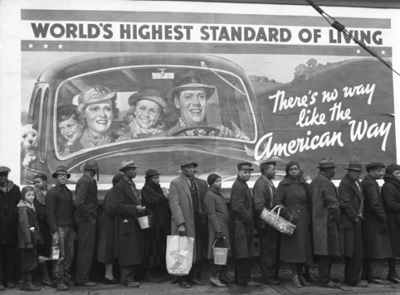
A single photograph can be extremely powerful when it puts together photographic, historic and social concepts. When a simple first look at a photograph evokes curiosity and questions us what we think that we know about determined society and its polarities causing emotional impact, we know it deserves a further analysis. It is the case of Margaret Bourke-White’s photograph called “Kentucky Flood”, taken in 1937 around the time of the Great Depression in America.

During the Great Depression post-war in the United States, the Farm Security Administration (FSA) was created as an effort to combat rural poverty and support farm workers and their families. As part of this program, photographers as well as writers were hired for this political mission to document and check under what circumstances and how people who depended on farms were living. These documentary photographs would work as educational material and press information to the public showing these people’s reality and needs. This way, the American politics would be demonstrating to the rest of the society, that actions were being taken in favour of this people.

The choice to use photography as the medium to spread this reality was not simply aleatory, unlike any other medium it refers the “truth to reality” of the facts, by considering that the photograph exists because they were there, it was taken therefore it actually happened, with the result shown in a fast and realistic way. Also the program’s photographers “were warned repeatedly not to manipulate their subjects in order to get more dramatic images, and their pictures were almost always printed without cropping or retouching” (Carlebach, 1988:20).

Working on a documentary style, Margaret Bourke-White was the first female photographer to work at Life magazine, where her photograph was published on the first cover. The weekly Life magazine was initially all photographic addressing American news, life style and politics, marking its place in the history of photojournalism and being considered one of the most important contribution to publishing. At this time, documentary photography and journalism started to work together more often, either for press or more detailed studies followed by articles like in Life magazine. The fact that the photograph is in Black and White is not only because colour film was not too common yet, but for a conventional reason mainly with documentary photography that the photographers using Black and White were the serious professionals who were looking at content and real meanings to their photographs. This mere convention has been around in the modern photography’s world until now, and makes us question if there really is a dramatic difference with the result when photographing in monochrome or not. For this particular photograph, which is very detailed with a number o people using their accessories and bags, the billboard’s text and visual information would probably make it look too crowded if in colour, as it has a lot of information, specially if we imagine that each person is wearing a different colour. In Black and White it all gets neutralised as if the colours are not so important for the context of this image, making it clearer, more realistic contact with the scene as it gets less interferences and easier to see the message behind it.

Parallel to the FSA another governmental program was running in the United States, the Work Projects Administration (WPA) which was formed in 1935, as part of a number of the New Deal agencies at that time, and this program was involved with employing people to carry out public works projects, and more notably it was giving work opportunities to artists linked all media/entertainment (music, drama, literacy and Arts). It was when the combination of artists and visual communication helped to create posters and billboards seen across America which worked as propaganda both to publish and advertise community activities and stimulate the society in a positive way, to bring back the “American Way”. This played important role to that recent hopeless society which was trying to emerge once again after the Great Depression, not only economically but also getting involved socially and to give back people’s self esteem.

They were composed by strong imagery made with illustrations, photos, texts and were colourfully graphic each one to convey a different message to the public, for varied audience at all the ages.

For this reason, the billboard that appears on Margaret’s photograph is as important to be analysed individually and as a piece of imagery which provides information about that historic time and its peculiar social behaviour values. The headline saying “World’s Highest Standard of Living” is a reference to the American’s standard of living, which is known and seen as reference around the world, and it is being illustrated there by a happy family formed by a couple with two kids and even a dog all onboard the family’s car. It demonstrates that they are a well structured family, in economical terms as they are able to have the comfort to own car, and consequently living in harmony and emotionally balanced. The second text is “There’s no way like the American Way”, which is again to stimulate American society reflecting back to what they have already mentioned is precious for them, the “Highest Standard of Living” is what differentiates them as a strong nation which was fighting to re-establish. This is to motivate, reaffirm and persuade the population that the government is working under crisis to maintain their honour, once they have got jobs back with FSA’s help, they could now feel more comfortable to invest on social life, consuming products to help increasing the economical movement in the country.

Getting to know all this background information, leads us to understand more what makes this a iconic image and the scenario behind its details. Looking closer to the photograph and the day it was taken, one more important information will reveal the photo’s contrasts and polarities, and even controversiality.

The photograph is a result of many others shots that Life magazine published, while Margaret was covering the incident of the devastating Ohio River Flood in 1937 which claimed close to 400 lives and left around one million people without homes in five states during the winter of that same year. These people there standing in line, are waiting for food, water and clothing from a relief station as a result of the flood, and many were probably homeless or having to live in shared accommodation at that critical moment. This is what most impacts us as viewers when we notice that they are right in front of the FSA’s billboard, suddenly the way that the poster turns out to be just a false illusion of prosperity when the reality of these people confronts the illustration. This way the photograph immediately warns the population that in fact other problems were out of politician’s control, and also that “The World’s Highest Standard of Living” is not for all the citizens, not all are being able to enjoy the “American Way”.

It is the point when the clever use of composition emphasises the well structured, promising, happy family and the poster’s hypocrisy with the hopeless, disadvantaged and vulnerable families in that queue. The way she chose to keep the people in line in the foreground, frames the centralised billboard making the viewers naturally look at both subjects in the picture and starts finding in what aspects they relate, also making comparisons and even stipulate which of the two subjects is the one in focus. It is as if the tension is concentrated in the bottom of the photograph, as there is a dark side or negative polarity where everyone looks serious, and the other part which is the most part of the image covered by the billboard is the light side or positive part of this polarity, containing the smiles and messages of hope. The line created by both the queue and the framed composition, crosses a new line for one more issue this photograph covers. The polarity in the image gets clear at this point, that in addition to the Great Depression and government’s attempts to re-establish the country and the flood as a natural disaster, the Americans portrayed in the poster are not the same ones who are waiting for food in the line. The ones who suffered more with all of these dramatic situations were the black Americans neighbourhoods, the black Americans that are not appearing as part of the campaign. Should not them be living on that same “Highest Standard of Living” the poster talks about? Or maybe, they were not yet included as being part of the American Way, as racially and economically they are not matching the American families and would not be portrayed how they were used to, when having the poster as reference. For sure, this is a very rich image simply created by being at the right place, at the right time, which gives the photographer the status of being a witness to the scene. It is demonstrated by the detail on top right corner of the image a windscreen wiper and at the same time creating a realistic eye level perspective as we were in the other side of the road, showing that it was not even necessary to get off the car to be able to create what now is a classic photograph of a specific period of time in the history. It reaffirms that it makes real difference when opting between to stop to both “look” and “see”, and that the photographer’s sensibility and approach to the scene is essential to involve both context and technique in a photograph that can make the audience get an emotional response to it.

This photograph that at first looks unpretentious combines two very strong and different types of imagery, in which together narrates the story of vulnerable families in contrast with the pretentious governmental campaign during the Great Depression time, using Art to try providing more hope to the population in a certainly unequal way, when compared to the poor living circumstances of the WPA’s farmers and those black Americans at the suburban areas affected by the Ohio River Flood.

In a time where photographers played important place contributing politically this photographs works as a subversive propaganda in a new campaign, transforming people’s opinions about it by questioning the American Way. Making it a very successful example that: “The photograph exists within a wider body of reference and relates to a series of wider histories”(Clarke, 1997:27).


PT/   Questionando o Estilo Americano

Uma única fotografia pode ser extremamente poderosa quando se reúnem conceitos fotográficos, históricos e sociais. Quando um primeiro simples olhar para uma fotografia evoca a curiosidade e nos pergunta o que nós pensamos que sabemos sobre determinada sociedade e as suas polaridades causando impacto emocional, sabemos que merece uma análise mais aprofundada. É o caso de a fotografia de Margaret Bourke-White chamada de “Kentucky Flood” (Enchente na cidade de Kentucky), tirada em 1937 na época da Grande Depressão nos Estados Unidos.

Continue reading

TAG: Meu animal de estimação

IMG_0252

PT/   TAG: Meu animal de estimação

Estava precisando falar de um serzinho importante na minha vida aqui no blog, e dessa vez decidi fazer algo diferente. Resolvi responder uma “tag”, que são perguntas ou desafios que correm pela internet e as pessoas respondem.
Essa tag vai ser sobre o meu animal de estimação.

Vou deixar em escrito respostas mais diretas, e no vídeo vocês encontrarão respostas mais completas e com extras. (haha) Continue reading