EN/ Questioning The American Way
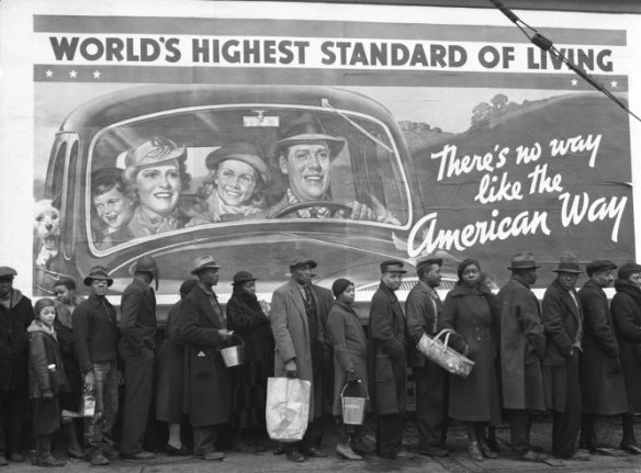
A single photograph can be extremely powerful when it puts together photographic, historic and social concepts. When a simple first look at a photograph evokes curiosity and questions us what we think that we know about determined society and its polarities causing emotional impact, we know it deserves a further analysis. It is the case of Margaret Bourke-White’s photograph called “Kentucky Flood”, taken in 1937 around the time of the Great Depression in America.
During the Great Depression post-war in the United States, the Farm Security Administration (FSA) was created as an effort to combat rural poverty and support farm workers and their families. As part of this program, photographers as well as writers were hired for this political mission to document and check under what circumstances and how people who depended on farms were living. These documentary photographs would work as educational material and press information to the public showing these people’s reality and needs. This way, the American politics would be demonstrating to the rest of the society, that actions were being taken in favour of this people.
The choice to use photography as the medium to spread this reality was not simply aleatory, unlike any other medium it refers the “truth to reality” of the facts, by considering that the photograph exists because they were there, it was taken therefore it actually happened, with the result shown in a fast and realistic way. Also the program’s photographers “were warned repeatedly not to manipulate their subjects in order to get more dramatic images, and their pictures were almost always printed without cropping or retouching” (Carlebach, 1988:20).
Working on a documentary style, Margaret Bourke-White was the first female photographer to work at Life magazine, where her photograph was published on the first cover. The weekly Life magazine was initially all photographic addressing American news, life style and politics, marking its place in the history of photojournalism and being considered one of the most important contribution to publishing. At this time, documentary photography and journalism started to work together more often, either for press or more detailed studies followed by articles like in Life magazine. The fact that the photograph is in Black and White is not only because colour film was not too common yet, but for a conventional reason mainly with documentary photography that the photographers using Black and White were the serious professionals who were looking at content and real meanings to their photographs. This mere convention has been around in the modern photography’s world until now, and makes us question if there really is a dramatic difference with the result when photographing in monochrome or not. For this particular photograph, which is very detailed with a number o people using their accessories and bags, the billboard’s text and visual information would probably make it look too crowded if in colour, as it has a lot of information, specially if we imagine that each person is wearing a different colour. In Black and White it all gets neutralised as if the colours are not so important for the context of this image, making it clearer, more realistic contact with the scene as it gets less interferences and easier to see the message behind it.
Parallel to the FSA another governmental program was running in the United States, the Work Projects Administration (WPA) which was formed in 1935, as part of a number of the New Deal agencies at that time, and this program was involved with employing people to carry out public works projects, and more notably it was giving work opportunities to artists linked all media/entertainment (music, drama, literacy and Arts). It was when the combination of artists and visual communication helped to create posters and billboards seen across America which worked as propaganda both to publish and advertise community activities and stimulate the society in a positive way, to bring back the “American Way”. This played important role to that recent hopeless society which was trying to emerge once again after the Great Depression, not only economically but also getting involved socially and to give back people’s self esteem.
They were composed by strong imagery made with illustrations, photos, texts and were colourfully graphic each one to convey a different message to the public, for varied audience at all the ages.
For this reason, the billboard that appears on Margaret’s photograph is as important to be analysed individually and as a piece of imagery which provides information about that historic time and its peculiar social behaviour values. The headline saying “World’s Highest Standard of Living” is a reference to the American’s standard of living, which is known and seen as reference around the world, and it is being illustrated there by a happy family formed by a couple with two kids and even a dog all onboard the family’s car. It demonstrates that they are a well structured family, in economical terms as they are able to have the comfort to own car, and consequently living in harmony and emotionally balanced. The second text is “There’s no way like the American Way”, which is again to stimulate American society reflecting back to what they have already mentioned is precious for them, the “Highest Standard of Living” is what differentiates them as a strong nation which was fighting to re-establish. This is to motivate, reaffirm and persuade the population that the government is working under crisis to maintain their honour, once they have got jobs back with FSA’s help, they could now feel more comfortable to invest on social life, consuming products to help increasing the economical movement in the country.
Getting to know all this background information, leads us to understand more what makes this a iconic image and the scenario behind its details. Looking closer to the photograph and the day it was taken, one more important information will reveal the photo’s contrasts and polarities, and even controversiality.
The photograph is a result of many others shots that Life magazine published, while Margaret was covering the incident of the devastating Ohio River Flood in 1937 which claimed close to 400 lives and left around one million people without homes in five states during the winter of that same year. These people there standing in line, are waiting for food, water and clothing from a relief station as a result of the flood, and many were probably homeless or having to live in shared accommodation at that critical moment. This is what most impacts us as viewers when we notice that they are right in front of the FSA’s billboard, suddenly the way that the poster turns out to be just a false illusion of prosperity when the reality of these people confronts the illustration. This way the photograph immediately warns the population that in fact other problems were out of politician’s control, and also that “The World’s Highest Standard of Living” is not for all the citizens, not all are being able to enjoy the “American Way”.
It is the point when the clever use of composition emphasises the well structured, promising, happy family and the poster’s hypocrisy with the hopeless, disadvantaged and vulnerable families in that queue. The way she chose to keep the people in line in the foreground, frames the centralised billboard making the viewers naturally look at both subjects in the picture and starts finding in what aspects they relate, also making comparisons and even stipulate which of the two subjects is the one in focus. It is as if the tension is concentrated in the bottom of the photograph, as there is a dark side or negative polarity where everyone looks serious, and the other part which is the most part of the image covered by the billboard is the light side or positive part of this polarity, containing the smiles and messages of hope. The line created by both the queue and the framed composition, crosses a new line for one more issue this photograph covers. The polarity in the image gets clear at this point, that in addition to the Great Depression and government’s attempts to re-establish the country and the flood as a natural disaster, the Americans portrayed in the poster are not the same ones who are waiting for food in the line. The ones who suffered more with all of these dramatic situations were the black Americans neighbourhoods, the black Americans that are not appearing as part of the campaign. Should not them be living on that same “Highest Standard of Living” the poster talks about? Or maybe, they were not yet included as being part of the American Way, as racially and economically they are not matching the American families and would not be portrayed how they were used to, when having the poster as reference. For sure, this is a very rich image simply created by being at the right place, at the right time, which gives the photographer the status of being a witness to the scene. It is demonstrated by the detail on top right corner of the image a windscreen wiper and at the same time creating a realistic eye level perspective as we were in the other side of the road, showing that it was not even necessary to get off the car to be able to create what now is a classic photograph of a specific period of time in the history. It reaffirms that it makes real difference when opting between to stop to both “look” and “see”, and that the photographer’s sensibility and approach to the scene is essential to involve both context and technique in a photograph that can make the audience get an emotional response to it.
This photograph that at first looks unpretentious combines two very strong and different types of imagery, in which together narrates the story of vulnerable families in contrast with the pretentious governmental campaign during the Great Depression time, using Art to try providing more hope to the population in a certainly unequal way, when compared to the poor living circumstances of the WPA’s farmers and those black Americans at the suburban areas affected by the Ohio River Flood.
In a time where photographers played important place contributing politically this photographs works as a subversive propaganda in a new campaign, transforming people’s opinions about it by questioning the American Way. Making it a very successful example that: “The photograph exists within a wider body of reference and relates to a series of wider histories”(Clarke, 1997:27).
PT/ Questionando o Estilo Americano
Uma única fotografia pode ser extremamente poderosa quando se reúnem conceitos fotográficos, históricos e sociais. Quando um primeiro simples olhar para uma fotografia evoca a curiosidade e nos pergunta o que nós pensamos que sabemos sobre determinada sociedade e as suas polaridades causando impacto emocional, sabemos que merece uma análise mais aprofundada. É o caso de a fotografia de Margaret Bourke-White chamada de “Kentucky Flood” (Enchente na cidade de Kentucky), tirada em 1937 na época da Grande Depressão nos Estados Unidos.
Continue reading →


